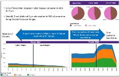
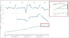
Visualizing Better Marketing: Adding Visualization To Your Analytical Tool
In a world of Big Data and increasing complexity, it’s gratifying to see data visualization technology evolve to help us more efficiently understand customers, identify the drivers of business performance and develop actionable insights that can be communicated to others in the organization.
Of course, data visualization is nothing new. But what feels new is the degree of importance software developers have put on making data discovery and visualization more accessible to a broader audience of users. It wasn’t that long ago that only the most tech-savvy and statistically-minded in the office generated insights with such data discovery tools as business intelligence and statistical software packages. For many business analysts, accessing data involves sending a request to the IT department and waiting for the report to be returned; any slight variation discovered in the data needed to support the analysis often requires sending an additional request and yet another wait. And if the analyst is using pivot tables or Access to understand the data, the software imposes file size limitations and, even after overcoming all those challenges, it’s extremely time consuming to create attractive and impactful visuals.
The new world of data visualization
After using one of the newer visualization software packages over the past couple of years, the old world of iterative data requests and Excel seem so last century—like the dark ages before voice mail or e-mail. I wonder how I would even deliver today’s level of analysis and insight to my clients without these modern tools.
The new software is blazing fast and deals with any size file. Drag-and-drop functionality is easy to learn and can be combined into multiple views of the data and an attractive dashboard-type report. You can create calculated fields on the fly and provide a great deal of flexibility when working with the data. In short order, you are able to create insightful views of the data that would have taken far more effort using any other software.
 With visualization software, I can spend far more time thinking about my client’s business and generating actionable insights, while expending less time managing data. The visuals are beautiful and impactful, and exporting images to PowerPoint is straightforward. I can then deliver reports and dashboards through the web directly to my client’s desktop. Drill-down, sort and filter capabilities—all provide my clients with the ability to generate their own insights from the data, which they can easily share across their organizations. This entire process happens almost as quickly as a conversation. When the visualization tool is fully enabled, quantitative analysis and key business drivers become a greater part of the conversation, it’s a game changer that allows organizations to focus on actionable and forward-looking metrics!
Technology solutions alone do not add value to the business
Organizational access to data is a wonderful thing, however, as the number of users increase, so does the need for data governance. The simple fact is that users can easily misinterpret data. Creating insights through data requires a deep understanding of the business need combined with critical and strategic thinking. These requirements are particularly true today as many business environments are increasingly complex and need to harness data to better understand the customer for organizational planning and investment strategies. Having this work firmly grounded in quantitative analytics requires an investment in two areas: people and technology.
People: Based on my experience, it’s better if the person responsible for the organization’s data strategy and governance resides organizationally on the business (marketing and sales) side, rather than the IT or finance side. This is best practice when developing an information warehouse capability, and I would argue it is equally true when creating views of the data for the organization. In today’s Big Data environment, this person needs the ability to see the big picture and not get lost in the details. When done right, this can enable an entire organization to become customer-centric. It’s not an easy job to synthesize data into something an organization can both understand and use to execute an initiative. Whether this person is a business analyst or a data scientist, internal or external to the organization, this role is critical to enabling a customer centric-organization.
Technology: At Environics Analytics we use a full suite of tools to manage vast volumes of data to provide our clients with products and services. We have all the software necessary to help our clients manage and analyze their data, including data warehousing, statistical and GIS programs.
Two tools in particular have added a great deal of efficiency to our business: Alteryx for data processing and Tableau for visualization.
Alteryx provides an intuitive workflow for data blending and advanced analytics that leads to deeper insights in hours, not the weeks typical of traditional approaches. The software is lightning-fast and utilizes drag-and-drop functionality to create modules that are intuitive, easily audited and executed.
We use Alteryx to process data for use in Tableau. This allows us to optimize the structure of the data for visualization and to operate within our quality control process.
Visualization resources
There are a number of other resources readily available to help your organization quickly leverage visualization software.
Tableau provides one of the best online training programs I’ve ever experienced. Their staff provides online tutorials, product guides, a knowledge base – which provides answers and how-to step-by-step instructions for questions and technical demands—along with the option to submit a request for information online.

Two books that provide a rich source of data visualization best practices are Performance Dashboards, by Wayne Eckerson, and Information Dashboard Design, by Stephen Few. Both authors write from a deep understanding of how data visualization can create a deeper
understanding of your business and they clearly explain how to create informative and compelling views of data.
Adding visualization to our tool set has undeniably increased our productivity. We are better able to uncover insights, helping our clients better understand their customers and business opportunities. We are able to support strategic and tactical development with quantitative analysis and data views that are insightful and actionable.
Great as it is, however, visualization software is not a panacea for all your business challenges. Where it really shines is when it is supported with the right data strategy, governance and resources. That combination helps users focus their organizational conversation around the customer and key performance metrics.
As auto industrialist Henry Ford once said, “If everyone is moving forward together, then success takes care of itself.” I can visualize just what he’ saying.
Mark Harrison is the Director of Data Science in the finance, insurance, travel and telecommunications practice

